Sunday, 27 April 2014

Coraline

One of our visual design projects for this year was to design a book character referring solely to the description of said character in the book, as well as their personality.
I decided to do Neil Gaimans "Coraline" - a sweet, twisted childrens' tale with a curious main character. Coralines description mainly relys on her personality, her appearance is basic - brown hair, with an iconic yellow boots, red scarf and blue coat. Initially, I felt I had chosen the wrong character to design - such a basic, every-day description surely couldn't produce an interesting character?
Then I considered her personality a bit more. How would I represent that in pure aesthetics? To begin with, I looked at imagery of young girls - mainly on dolls, in order to get an exaggerated personality in a purely aesthetic way.
 From here, producing silhouettes to attempt to explore poses, as well as how to give her an iconic look. Wild hair or fluffy hoods seemed to do the trick - but getting across certain aspects of her appearance without making her seem too old was difficult. Ideally I wanted to get across she was young and small for her age, but give her practical enough clothes so that she could be adventurous and explore with ease. In reality at the age Coraline is - of which I envision to be around 10, she would still be being brought clothes by her mother - so no doubt they'd have feminine aspects to them.

 Exploring with how wild I could make her hair was good fun, as well as focusing in on her features. In the end, wild short hair seemed to fit best - not to say that I wasn't tempted to play around with cute hats and hoods.
 Further developments found me experimenting with the aspect of how girly I should make her - playing around with the level of doll-like clothes, dress coats and hoodies. Honestly, I liked the majority of these choices - but some of them were either too over the line of doll like, and others made her look a bit too old for what I was going for. In the end, I decided upon the first one - simple, noticeably feminine yet with the wild hair which made her stand out silhouette wise. Finding a colour for the shorts to match the somewhat large cluster-f of colours that was going on with her design was a bit of a pain. In the end, after playing around with the hue, a purpley burgandy seemed to fit best - paired with yellow highlights and blue shadows it seemed to fit well.

As a side project, I had a go at modelling her face entirely in ZBrush. Childrens faces are difficult to do, I now understand why in so many games you rarely see accurate children.


And so it comes to and end, once again.

The second year has flown by! It’s actually scary. In a years’ time I’ll be almost finished this course completely, searching for employment and hoping to land my dream job.. or join mum in Asda making pizzas. No, wait, I discussed this with my parents – aim high in retail, go for John Lewis for the bonus.
Now to question everything I’ve done this year, and everything else in life. What are universities for? I’ve spent 2 years on this course – 3 years at this university specifically. For me, who considered not going to university at all due to “omg student debt” and the impending judgement of not being as good as my siblings were, university has acted as a huge guidance for not only my career opportunities and progression in my ability, but for everyday life. This year especially, university and this course alone has helped me through some pretty crappy times, and I’m unbelievably grateful. It’s allowed me to rediscover what I love, and enjoy everything again.
And that’s one of the things I want to get out of university – passion, enjoyment, showing myself and others that I can do it and that I don’t compare to either of my siblings. And then there’s the fundamental aim of university allowing myself to enter into the world of employment – and I understand that it’s as much my responsibility too. Slowly I’m getting there, more confidence to display my work, and even seeing progression in ability and understanding. Thinking back to last year, getting so frustrated with how everything would turn out, and to now, how I can produce things much smoother and quicker.
For example, 3D at the end of last year, my gladiator. I never wanted to look at him again but I guess we must all laugh at ourselves at some point. The project where I made him too baby-faced so I just added blood and scars to make him look older. Oh dear. The texturing isn’t the worst though I guess.. But the anatomy is poor.
In comparison to the Mortal Engines character project, to which I’m not happy with the final outcome in the slightest due to the textures not baking down correctly, and design not coming across as effectively as I would have hoped, the anatomy is there and I have learnt new skills, building on my knowledge and finding more things I enjoy about character art. Sculpting in ZBrush is one of the most enjoyable, therapeutic things I’ve encountered yet!
My environmental assets have improved a hell of a lot as well. Going from the beginning of the first year creating this:
To the beginning of the Second year creating this:
 Looking at this progress, as well as creating multiple environmental assets for the group project, I’ve discovered more of an enjoyment for modelling environments as well. Learning about the T-shaped skill model has allowed me to realise I shouldn’t ignore any aspect of game art just because I don’t enjoy it as must – because surprisingly enough, you might actually enjoy it in due time.
In regards to visual design? I feel I may have neglected it somewhat this year. My thumbnail prep sketches still take too long, but I’m finally getting the grasp of perspective. And watercolours have been reintroduced into my life this year – love love love this fact!
In the final term of this year, before the summer, I hope to get a chance to revisit traditional mediums and redo some of my finals from the beginning of the year. I see that they aren’t my strongest, and my returning motivation is the best thing about this year as a whole – just even considering this is a huge step for me at the minute and I can’t wait to continue developing next year – not only my skills as a student and potential industry employee, but as a human being as well.

Too deep, lolkbye.

Life Changing or Career Building?

Education is a pain in the butt. It’s fun, satisfying and rewarding being taught, but in a class of students there’s always be a few who are unhappy with how things are being taught, or what they are being taught. I really don’t envy tutors in the slightest. The decision making as to how to teach students, as well as what’ll be more beneficial for them in the long run must be incredibly difficult.
Fundamentally, in my opinion it narrows down to providing the motivation and support to inspire a student to learn themselves – none of this spoon-feeding high school crap. It’s a large leap, but incredibly beneficial to everyday life.
Now a journey into the life of little Rachey-poos, or twinkle-toes, whichever.. A-level psychology, we were literally spoon-fed everything. One tutor would write down the entire lesson on the board, we’d sit the entire time copying his notes and expected to learn them that way. He was good at distractions and motivational life speeches, but giving us the motivation to go away and learn the notes? Not so much..
Another would give us a workbook per topic we did. Lessons would consist of filling in up til a certain page through copying from a book, then homework would be to do the same. Not learning, not motivating, not inspiring.
The third changed too many times I can’t remember how each of them taught – the other teachers  would joke her chair was cursed, as each tutor was either went on or was returning from maternity leave.
In reality – there isn’t necessarily any “choices” with teaching methods and providing the correct knowledge at university.. that was worded wrong. Correct knowledge is needed.. brain fart moment. But the providing of basic and fundamental technical knowledge is an essential part of learning – learn and master the basics, and from there you can manipulate and learn more from them. However, with a course such as Game Art learning “soft skills”, this referring to our personalities and personal traits, how we come across, is important to employability. We’re game artists – the majority of us are hermits drooling at the mouth when faced with stressful situations. We need to learn to be human for once in our lives. Once again – basics, which we can develop on ourselves. No one knows what skills we’ll need in the future, so only us as students can prepare ourselves for that by taking in the fundamental basics.
Education doesn’t solely rely on the tutors, and in modern days I feel they get a lot of beatings in regards to student grades and attendance – a tutor can only do so much, they can’t piggy-back us across the grade threshold because we tried and did a pretty picture. If we can do better, there’s no point pussyfooting around it.

Some game companies want highly trained graduate artists and programmers, whilst others claim they really prefer creative individuals with a good Liberal Arts background – a tricky dilemma as to what to focus on. And once again, I answer this by repeating myself – the sudent-tutor relationship relies on both parties participating to help one another. Show us the basics of each, then it’s up to us to seek out further information, or hell, just ask.

Creativity is everywhere!

Wikipediea – you know, the most valued and reliable of all resources.. – describes creativity as a phenomenon whereby something new and valuable is created. The ideas and concepts so conceived can then manifest themselves in any number of ways, but most often, they become something we can see, hear, smell, touch, or taste.”.
It is also said, from Human Motivation, 3rd ED. By Robert E Franken that “in order to be creative, you need to be able to view things in new ways or from a different perspective”. This is something that I don’t necessarily agree with – creativity doesn’t have to be something “new” – very seldom do we see anything new anymore, it’s all been done before we just get a refreshing reminder as to its existence being replicated and appreciated. Creativity can be expressed in a whole range of different mediums, and by a whole range of individuals – creatures and humans alike.


Would you deny this elephant the title of “creative” just because it could possibly be simulating what it has been taught? It’s an elephant painting. That’s pretty damn creative if you ask me.
Fundamentally, creativity spawns from the ability to create – not necessarily demonstrating its way in an artistic form.
For example – my brother at university is studying electrical engineering. At first glance, would you say this is an uncreative course? He had to design a working robot, and was designing and developing high tech jet helmets on his placement year at BA Systems. Design and create – essentially, be creative in a functional and practical way. Don’t tell him that – he’ll deny it. Creative courses aren’t real in his eyes. He still can’t draw to save his life.
Game art could be seen to resonate with this somewhat – as artists, we create to entertain and provide a function in other people’s lives – creating and designing the assets or concepts to provide entertainment. Not only this.
But that’s just one side of creativity – it doesn’t necessarily have to have a practical use. The fashion industry strives on impractical outfits and footwear. Since when did heeled shoes become a good idea? Let alone when the heel is a rabbit.

Irregular Choice shoes.. irregular indeed
But still, they are an incredibly creative, impractical design that provide entertainment and adoration for others. They also come in purple with grapes.

In terms of technology hindering or furthering creativity?  I believe it furthers it. My brother would not have been able to create his robot without the technological advances to make it possibly, and those shoes would not have multiple styles if not for technology to create the shape simply.
And 3D printing, this does not necessarily hinder the creative process – if anything it once again enhances the possibilities of expressing and presenting said creativity. An idea can be creative, however the means to express said idea may not be obtainable, or the ability may not be had. Technology helping with creative expression – to some extent, not where it’s programmed to create masterpieces itself – does not mean that expression is any less valid. And I suppose in some way the creation of such a computer programme would be creative in itself…
And cake. Cake is creative.

You’re not coming at anything new. But there’s a creativity behind the flavour combinations to create a taste sensation. It’s neither practical nor necessary. But its cake and it needs no reason.

Cake designs can be super creative as well – not just fancy wedding cakes or cute little cupcakes. It’s not nothing new – the creator didn’t create the sloth or cake itself, she didn’t necessarily have a new take on cake making, as 3d cake sculptures aren’t a new creation, she simply combined the two into one creative outlet. A cake sloth.
https://www.facebook.com/pages/Conjurers-Kitchen/344642805569135
This is more creative Imagineering. I don’t question its existence. It’s beautiful.
I also think cake is a good place to finish this post.
https://www.facebook.com/pages/Conjurers-Kitchen/344642805569135

An introduction to the Game Industry: From generalist to specialist?

I think in the past I have mentioned how I wish to become a character artist, correct? Moving on in the course we have slowly come to focus slightly on the area we wish to “specialise” in. However, if the course has taught me anything it’s that you should always cover your ass. In the majority of industry companies – predominantly indie companies due to the lower funding and such, it seems that individuals will take on a “T-Model” – this meaning that they have a breadth of knowledge about multiple subjects which accompany one main area of expertise – or a specialisation.
For example, a character artist will specialise in, well, characters – however have knowledge on additional information such as rigging and animation. It’s very rare for a specialist to appear as an entry-level job without a dazzling portfolio. I believe Valve tent to hire more T-shaped people than I’s.. Google images inspired that, it’s terrible. This makes sense though – people with a general number of skills will be able to switch work and collaborate easier, and in generally function more comfortably within a team.
In general, a team’s structure will look something like this:
The majority of game teams will be made up of the same core elements – however, specialists are more likely to occur within the art, design or programming teams. An individual will originally start as a junior, being given a range of tasks with limited responsibility, then have the opportunity to move up the corporate ladder. 
And if you want to view it in the dickish way – hiring more generalists will mean you have to hire less people, as the knowledge is broad amongst the whole team. This makes sense as to why many companies are outsourcing for specialist jobs, rather than hire numerous amounts of specialists – especially if a role is temporary and will be lost on game completion.
Essentially the game industry is one big huge “cover your ass” lesson – but we can’t really cover our ass on outsourcing. Unless we move and get hired by a company which is outsourced. Unless they outsource as well.. A never ending loop of disappointment and shattered dreams.

Elements of game technology, part three: interaction design

Over the years, looking at game technology itself, the general aesthetic hasn’t necessarily changed – cartridge or disc slot, eject button, an on button.. The only thing that really has changed is the obvious existence of a reset button on consoles. I would say this is due to technology improving issues with console issues but... red ring of death and so on.

As games have become more demanding on a system, fans and vents have been introduced, but fundamentally they all have the same core aesthetic practicality as always. And this is for good reason – change what is considered the norm, challenge generations’ knowledge of a console then the ability to market it to the majority falls through, unless they’re willing to learn an entire new way things work.
The same applies to controllers – the SNES had it sorted, laying the foundation as to what we consider a controller pad today. The d-pad and 4 action buttons, with ‘start’ and ‘select’ buttons became the default on all controllers, as well as the layout. Obviously they were doing it right. Joysticks, shoulder buttons and a new way of gripping a controller were added with the N64, and although slightly modified, these continued until the current and next gen consoles. The joysticks made game interaction a lot more smooth – adding in the ability to control the camera direction whilst still moving the playable character.
It is simply the “unnecessary” aesthetics that have changed over time – the sleekness of the design, materials, and additional features such as sensors to accommodate the introduction of new technology, such as motion control and alternative tracking technology. These all being done to attempt to increase the interaction with a game environment.
However, new technology which adds a new level of immersion to the gaming world would be the Oculus Rift – completely isolating the user’s sensors to focus entirely on the game in front of them. This combined with the stereoscopic 3D view allows the player to experience depth different to that of a 3D film of TV, allowing a different experience to simply playing a console game on a 3D screen. The ability for the headset to track the wearers head turning in real time allows a more intuitive interaction with the gaming level, giving the camera control a more natural feel.
In reality, the oculus rift takes a lot of 90’s kid sci fi dreams and creates a virtual reality headset, and no doubt the boxy aesthetic of it will change as time progresses as it has done with controller pads.
Before I finish this post, I want to share a video of someone using the Oculus Rift to play a game called “Alone”, it demonstrates how the technology can give a game an entirely different feel and disorientate the player due to the sensory focus and situation the game has them in.


Elements of Game Technology, part two: sound for games

A game could have the most visually awesome effects, smoothest animations and tastiest plot but without sound – whether it be ambient or a full-on orchestral masterpiece – then a game is lacking so much that could add to mood, emotion, narrative and a connection between characters and the player.
Music can characterise so many emotions, feelings and even themes in a game, putting a player on edge and engrossing them further into a story. One game which really springs to mind on its use of ambient noises is that of Amnesia – of which everyone has probably gone on about to death about the way it manipulates sounds to terrorise the player.
The sound in amnesia is also used to symbolise danger and safety – changing the tone in the ambience and sounds to create either terror or a moment of necessary calm when the game calls for it.

This in comparison to the “monster chase” sounds really demonstrates the variety of emotions a soundtrack can produce – and not only link to the players feelings and letting them know key events in a game, but also linking to the in-game characters ‘emotions’ during a scene, this causing an immersive link between both player and game.

Even from the title screens music, from staying idle on the screen to when you click “play” it sets the tone for what is to come. Paired with the animation of moving towards the door it just screams the tone for the game, instantly setting the player up for what is in store. Playing this same scene whilst muted definitely does not have the same effect – losing all sense of terror and leaving too much of a vague air about what the game could entail.

Soundtracks on games can also indicate the era in which it is set, for example Dragon Age: Origins’ soundtrack has a more Celtic-inspired origin, and could possibly dignify the progression of the games story itself – beginning calm as all the character origin stories do, then varying in temp and introducing more “violent” and dramatic sounds to the theme. Not only that, it’s beautiful to work to.
On the other hand, it can additionally be used to fill space and stick in your brain, making you do nothing but think about a specific game and make you want to play it for old time’s sakes. For example, the original “Sims” ‘Build & Buy’ soundtrack is now what my mind links to the penultimate shopping song. On first listen it seems like just mindless background noise – of which is more than likely is knowing EA and the way they produce their Sims expansions – however each some somehow captures a specific feeling of “lets shop”. From playing the game on mute it shows how it does add something to the enjoyment of the game, no matter how annoying the songs actually are.

Elements of Game Technology, part one: game engines

One thing the gaming world isn’t necessarily lacking in is the access to a game engine. There’s plenty around, so the ability to find one which specifically suits what you want to create is pretty secure. Personally, I’m not overly savvy with game engines, I love seeing what I have created in engine when compiled into a playable level, but when it comes to learning and navigating the engines controls I’m a bit timid and unsure. Let’s just say when something goes wrong – even the simplest of things - I have no idea what I’m doing. An unselectable 8ft apple core is a rather unsettling thing to be faced with.
As I’ve recently been using it, let’s start with Cryengine. This engine is the officially licensed tool for pretty much all next gen gaming consoles, and remains the only all in one development solution for the PC, Xbox 360, Playstation 3 and WiiU. It has a version of itself that is free for non-commercial production, and 20% of its revenue goes towards indie game production. It’s capable of generating state-of-the-art physics which can be applied to the majority of objects, and making them react in a realistic way to an opposing force without use of an external middleware. It’s also very powerful when it comes to AI, having the ability to use modular sensory systems to handle character behaviours.
 In comparison to other engines I have used, its interface is very easy to get the hang of once shown. The importing of assets is very simple and instinctual, relying on a simple drag-and-drop format into well categorised folders. And once an asset is in engine, graphically it looks pretty damn impressive.
The sandbox makes a levels creation super easy – giving the creator the ability to adjust assets in real time, speeding up production. I personally found the ability to adjust the scale of an asset, as well as the hue of specularity and the asset itself to be incredibly useful – as opposed to going back 3Ds Max to adjust a model having to reexport it, or adjust the colours in a texture sheet,. In addition to this, the similarity between 3Ds Max’s interface and Cryengine makes it very simple to use – especially when it comes to compiling textures to create a material.
Something I cannot find evidence of Cryengine doing, is supporting Android or IOS, this being something that the Unreal Engine does, alongside the Playstation Vita. In addition to this, Unreal Engine can be used to create both  a cinematic experience and more simple games such as side scrollers – this more than likely being the reason as to why it’s suitable for phone and tablet game usage. Once again UDK offers a free education, non-commercial use version. For production use it’s a $19 monthly subscription with a 5% royalty on gross revenue – this being said to be more cost-effective for studios and young developers.
This is just two examples out of a number of game engines, also demonstrating how different engines and be suited for different people depending on what they are producing.

Sources:

Wednesday, 22 January 2014

Elements of game design, part six: documentation

I was contemplating this entry for a while – using it to somewhat organise my thoughts on next year’s final major project. My documentation isn’t too fantastic granted, so it’s something I need to improve on as it is important and used throughout the entirety of a project – being used to report on progress, present ideas, concepts, organise thoughts as well as to be there to constantly refer back on to progress or revaluate ideas. In addition to this, documentation of a project will outline specifications and limitations to assets that would be designed – stating tri count, texture limits and the frame rate a level will run at.
As I’m not entirely certain as to what I want to do for my final major project – there’s a huge variety of themes, genres and stylisations I could apply to the project to make it more interesting, I feel that more contemplation is needed than a single blog entry on how I would personally go about organising and allocating my time to the project. In addition to this, as I ideally would like to do characters, I would be overlooking certain aspects which apply to entire levels of environment-based projects. So instead I’m going to outline the possibilities for the group project that has just began – in which the idea is to produce an exploration/vague narrative based level, somewhat in the style of the game “Dear Esther”.
Aims:
High quality realistic textures
Accurate, logical topology and flow lines to all geometry
Interesting silhouettes
effective mood portrayal through colour palette and lighting.
Software:
For this I would be using 3Ds Max, ZBrush, Photoshop, and any additional normal map generating programs.
Platform:
PC, current generation consoles
Audience:
For this I would aim for an audience of 16+, this meaning I could include some more mature themes, yet as the games genre is more exploration there would be no need for profanity, nudity or gory/violent themes. The game genre itself would rely on the maturity of the player, and appreciation of aesthetics and subtle narrative rather than action and explosions.
Genre:
As stated before, an exploration, narrative-base.
Technical Specs:
The environment would be required to meet the frame rate of current generation consoles as a minimum in order for the game to be portable with minimal lagging issues. This appears to be around a minimum of 30FPS, ranging up to 60FPS at 1080p for the Xbox One and PS4. In order to make sure I meet this, I would be logical with where I allocated tris, giving key assets a priority with about 1000 tris for environment props with full texture mapping. A vehicle would have up to about 7000 tris. A level with minimal characters would in theory allow them to have about 8000 – 1200 tris, with full texture maps. A minimum of 2000 tris being the lowest, mainly intended for LODs.

Texture maps:
For an environment I would be able to use multiple tillable textures, limiting them at 512x512 as a maximum. For more detailed texture sheets, such as if I were to include a character or a heavily detailed object that would be seen close up, I would perhaps  use a 1024x1024 as a maximum – for example for a main character, however in minimal amounts as to keep the frame rate at its optimal

Wednesday, 4 December 2013

Elements of game design, part seven: level design


Level design and environment design are two separate aspects when a game is in development, although are not necessarily held as completely separate elements, as generally the jobs are interchangeable with an individual in the industry. As I touched upon last year, environment design refers to the aesthetics of the assets which are places in the environment – an environment artist will model, texture and on occasion light an environment to create a visually appealing level. Level design refers to the assembly of said environments. In general, a level designer will design gameplay elements, as well as create scripted events and test gameplay – basically, the interaction with the environment artist’s creations. Their job is to create a level, environment or world in which a player can interact with and not get bored – and depending on the game type, avoid replication the mundane tasks of an individual’s everyday life. Then again this is really just a suggestion, as if people can find a game based around mopping and cleaning interesting as long as its blood, guts and in space then who knows.
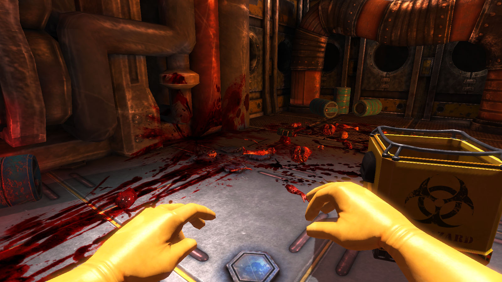
Viscera Cleanup Detail - The space-station janitor simulator
Generally, what can be classed as good level design can be categorized into fundamental “rules” as it were. Starting with the navigation through a level – this being one of the core interactions a player has with the environment they have been presented. Crap layout can hide visual cues as to where a player has to go – in most cases this comes in the form of a light source, corridors,  colour coded areas such as in mirrors edge, blocked off “you can only go this way” sections, or the way in which the scary monster just went. Good navigation creates a good flow within a games level, with consistent themes throughout a game allowing a more instinctual interaction from a player.
Another suggested “rule” of game level design is the use of environment to tell the story, relying on just the right amount of visual cues to allow the player to immerse themselves and uncover the story for themselves without it being shoved down their throat. Narrative aspects of a level can be done in three ways, explicit – referring to text or speech, implicit – referring to the environmental cues, such as in Bioshock or Fallout 3’s use of notes, and emergent – this being narrated by the player as they travel through the level.
One of the more optional aspects of good level design is the players’ interaction with quests/objectives, and how they are to be fulfilled. In the Elder scrolls series it is a general running design that the character gets to choose their morality, and how certain quests can be ended – this affecting the environment around them in multiple ways. This leads into gameplay – quests and locations of interest should be distinct in their marking, with the option of how a location is interacted with being determined by the player. Doing so allows a game to steer away from repetition, giving some more variety in doing tasks and interaction where the player feels as though they are writing their own story.
The difficulty of a game is a sign of good level design – although maybe not one of the most important ones. I personally know I appreciate it when a game allows myself to select what difficulty I want to approach a game in, allowing me to get the enjoyment I want without unnecessary rage quitting – AKA: Dante’s Inferno. Adjusting the levels of enemies, difficulty of environments and the levelling curve via the adjustment of the difficulty can create a more rewarding experience with a personal feel.
Level design, in reality, wants to create an easy-to-play but not in your face, personalised, interesting and all round awesome experience for a player, showing off the visual environmental designs to their fullest whilst creating flowing, logical interaction with them which both strays from everyday life, but maintains balance in the real world with its understantability and interaction with an individual’s awareness and intuition. They should create emotive responses which fuel gameplay, with levels which highlight specific mechanics within a game.

Sunday, 1 December 2013

Elements of game design, part six: Visual Composition

Visual composition is an aspect that I find personally can be easily over looked when producing images, whether they be from life or an imaginative piece. It’s much easier to go “Hey, that looks alright” then to analyse and consider every aspect of the image. But this is something that’s important, as the composition of a piece can make or break certain aspects of the image, and I personally know is something that I need to actively consider more thoroughly.
The easiest way to approach this topic would be to break up the subject of composition into its’ key elements, so let’s do that. Firstly let’s approach space, referring to the area around and between objects visualised. This will give off the silhouette of an object, and generally the main focus of a piece depending on the intricacy and interaction of an object with its environment.
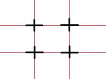
Generally, the layout of an image can be subjected to the rule of thirds – This is definitely an aspect I need to consider more, as generally the eye is drawn to the centre of an image which can create a somewhat static and uninteresting image. The idea behind the rule of thirds is that a 3x3 grid is drawn, the intersection of the lines of the grid being where the key visual aspects of an image will be situated. Adjusting the balance and symmetry of an image in this way can create a more dynamic piece.

The key aim of any image, whether it be a fine art piece or a design, is to simulate a 3D form in a two dimensional medium. This can generally be done through the use of the basic shapes used to create an image – for example cuboids being used to create the angle of the shoulders. With this, the general way to make something appear as though it has that depth is to show at least 3 faces of an object or shape. If not, 3D form can easily be low.
Values are another way in which depth can be created in composition, applying varying intensity to simulate foreground and background. This is something I have recently just grasped, however still have trouble with incorporating into  my designs due to the observational trickery of “that’s obviously in dark shadow so let’s make it intense” despite it being in the far background. It’s all about artistic judgement, and adjusting what we see to translate in a more effective or visually pleasing way on paper.
Values can also denote materials and textures, adjusting the “specularity” of an object can dictate whether something is shiny or matte, something which can bring life to an image through its application.
An addition element of visual composition is the application of colour. And this will be the last one I touch upon in this post, as this is a super long essay-bearing topic and I’ll save you the eye strain. The use of a large variety of different shades can frankly create a mess, on the verge of cluster-fuck, of visual unappealing proportions. Keeping the hues on a similar scale, but adding a key colour can create a more dynamic and smooth unity within a piece. This can be demonstrated across the years through many fine art masters – for example “Hylas and the Nymphs” by John William Waterhouse, or “Lady Godiva” by John Collier. In addition to this, colours suggest mood, temperatures and can dictate the softness of an image.
Hylas and the Nymphs
Lady Godiva
To sum up what could be an epically long post somewhat cut short, composition is more complex than one could initially suspect – a lot of artistic judgement, adjusting and concepting is needed in order to create the most aesthetically appealing piece – not to mention critically analysing yourself and your approach. A single misjudgment in colours, values or the composition could deteriorate an ideas representation. And that would sort of suck.

Wednesday, 27 November 2013

Elements of game design, part five: planning and concepting

So I really should crack on with tasks, attempt to vocalise myself whilst I currently under go numerous brain farts and brain dead drooling in a corner.
Any set project, whether it be in the gaming industry or an alternative design occupation, undergoes a series of design processes in order to obtain a well-rounded final outcome. As I can refer more accurately to the projects I have been set over the past year and a quarter, it’ll be easier to pick the process I personally underwent in order to get my final outcome. In my opinion, the initial stage of concepting is possibly one of the most important stages of any brief, and whilst it can be the most time consuming aspect, I have found that a large, well thought out concept for a design – whether it be environment, character or vehicle – will generally produce a more effective final piece. The initial concepts of a design are an aspect which will constantly be referred to throughout a project – being adjusted as they go along, so in reality need to be produced in large batches in next to no time at all.
From my own projects, the process of concepting begins with research, gathering images and ideas from either primary or secondary sources for accurate representations of what the projects brief may be as well as suggesting stylisation and themes.
From here, a large quantity of silhouettes, thumbnails and prep sketches are produced using said research in order to gain the most eye catching form – with any design, an interesting silhouette can make or break its recognisability with an audience. These will then be narrowed down to the most attention-grabbing forms, their interior shapes developed and moving onto stylisation and colour theory application. I personally find that combining and nit-picking at silhouettes & interior detailing can help produce a more well-rounded design – although I find that caution needs to be applied with this approach, as a design can very quickly become over complicated, busy and impractical.
In addition to the initial concepting, the way the files are planned and organised are an essential aspect, as in industry concepts will be shared by multiple artists. Numbering silhouettes, file names and titling layers in photoshop files give ease to adjusting a concept later down the line, as well as ease in locating files and such. Planning out time management is also an important factor when it comes to not only concepting but the overall project itself, as if deadlines are not set and aimed for, a final design may be out of reach – or just take a lot longer to get to. Or, on the other hand, the final could be underdeveloped if not enough time and planning is given to concepting. In order to attempt to avoid this, I’ve given myself more time to focus on the initial concepting stage – as part of me still dislikes silhouettes due to the unreadable nature of the inner workings of a design at the first stage, I understand how important this is to a design and see it as something I can constantly better myself at. In doing so, I will be more of a valuable asset when it comes to the group project later on in the year, as well as demonstrate important abilities to everyday life.
All in all, concepting is more difficult than it may be initially thought. And I’ve used concepting too much in this post. Concepting, concepting, concepting. It’s no longer a word with meaning.

I realise this post may be rather dull due to the lack of images, as well as references, however I was at a bit of a stand still as to how to reference something like this topic. Next post should – hopefully – be more interesting.

Sunday, 10 November 2013

Apparently I can be happy with my work.. who knew?
The past two game production products I've been relatively happy with the outcome - and obviously I could always do better, do more, and so on, but a standard I'm content with is quiet nice.
And yes, I may be procrastinating from the visual design vehicle project a bit by writing this blog entry.. but I hate vehicles. And presentations.

So the current project is to design a building which will fit between two provided, fully textured meshes. So I naturally went with my first cliche thought to do a Chinese restaurant.
Well, not really just a Chinese restaurant. Mainly inspired by the scene in the movie "Spirited Away" when Chihiro's parents are turned into pigs - more of an outside buffet idea. Ideally, I wanted to give it an appearance of a converted apartment building - a sure safe way to maintain the brief and make my design fit between the two buildings provided. Basically, taking typical, traditional Chinese shapes and applying them to a store-front styled design, with an open buffet/seating area 


 The one thing I was looking forward to about this project was the amount of baking I would be doing to a lot of the geometry - not necessarily having a strict, low tri budget meant I didn't have to be as strict with certain geometry - for example the roof canopy could actually have geometry and maintain its silhouette somewhat, but I doubt I could have a 10,000 tri asset attached to the scene and explain it somehow.


I even baked a little mooncake. It was a bit pointless, but I couldn't resist.
The final result I'm overall please with the appearance - it conveys what I wanted to, despite the fact I may have been a tad lazy/apprehensive to attempt parallex mapping to create a kitchen scene within the openinn and instead added shutters. I could have used more decals however, to grime up the place - however with the limited texture budget we had I didn't want to include too many details which would be blurry and distorted on the final object.


Sunday, 20 October 2013

And so another year begins


Summer could not have gone slower, seriously. Stressful, tiring and lonely – made me remember how much I actually miss having friends and things to do. Sometimes. I probably could have done a blog post or two, but as I don’t necessarily enjoy having a presence on the internet and spouting nonsensical thoughts I found procrastinating in cakes and exercise more worthwhile. I did attempt a group project with some friends, it made me realise how crap my laptop was as in the end 3Ds Max wouldn’t even open on it.. So say hello new desktop – it’s beautiful and I love it. I’ve managed to do some 3D modelling before my laptop went kaput though. I think I improved, although what I produced was worthy of the pits of hell due to her under thought design.

I really need to draw more men.

We’re in week 3 now – coming up to week 4 of the second year, and looking back at the first year I can already see an improvement with my environments. After a huge plateau over summer its quiet nice to acknowledge improvement – not saying that I still don’t need to improve. I do. Majorly. But that’s not the point. I can sort of do perspective now, yay!
             

Values and colour seem to be a bit wish-washy, I can tell undertones in shadows and highlights when looking at something, and I grasp the idea of more distant items having less detail therefore a lower value, but replicating that? It appears I have ups and downs, where sometimes I can get it to somewhat work, and others not so much. It seems to depend somewhat on the subject matter – more organic items I love doing, trains and buildings are boring and too linear. But also time spent on it – thumbnails are meant to be quick but I ended up spending about an hour on some of them from Abbey park. Attempting to avoid doing that for Loughborough train yard and the Guild hall seems to make me want to produce nothing worthwhile.

My 3D has visibly improved, the way I work and think through the appearance of the final outcome – even with something as boring as trash – rather than doing the bare minimum due to wanting to throw myself out of a window from frustration, I’m instantly thinking of ways I can add to the scene. I attempted to give a bin bag a split with stuff falling out, and instantly thought of an environment it could be placed into. I considered two environments instantly, even! That’s new, thinking of possible environments is one thing but multiple ideas is another. Hopefully this thinking maintains itself through the year.

 And whilst I’ve improved and started enjoying environments more, no matter how frustrating the new aspects needed are, I still find myself attracted towards the human form, and characters. It’s still my ambition, unwavering, to be a part of the production line to well-rounded characters who produce some response from a captive audience, whether it be adoration, admiration or hatred.
I feel my life drawing has improved since the first year - however I am too linear still, taking refuge in the definite of "this goes here" rather than suggesting - which could be more worth while on quick 1 and 2 minute gesture drawings.
Week 1
week 3
week 3

The second year is no doubt going to be more stressful – so I’m kicking in and getting on with it. Trying to keep up to date – working through blinding migraines may become a more regular thing but this is what I want to do for a living. It’s time I start making it seem that way.

Thursday, 23 May 2013

First year is over, lets review!

The first year is pretty much over, final hand in is tomorrow and a long summer break is looming in the distance. So what better time to reflect on how shit my work used to be in comparison to now – especially after presenting all my work, I’ve had a chance to glance at everything and see that maybe, I have improved in certain areas.

The majority of the first term, I was learning something new every day. It was fantastic, learning new skills and feeling as though I am progressing even after doing nothing. Having never actually done perspective or environments before – or if I had, never doing them in a technical or accurate way – I was producing for lack of better words, complete crap. Getting the basics down was more important than rendering, and when I’d gotten what I thought was pretty accurate line work in a thumbnail, when it was transferred to a larger scale and I attempted to render it, it completely went to pot. In reality I feel I'm still the same as this, and need a lot more work doing to perspective to improve - so much so that it's almost an impossible feat really, but hell never know unless you try I guess. This mainly refers to 2 point perspective - as I've not improved in this in the slightest.
2 point perspective still super needs work


Term 2 was abysmal - I produced substandard, uninspired work throughout it's entirety and ended up with a barely passing grade because of it. I plateaued, with little to no progression in anything - uni work or anything outside of uni, and if anything declined in my works standard. This including design projects and observational ones. I produced a terrible character, a poor nonsensical vehicle and poor studies of still lives involving people. In addition to this, I discovered I can't use marker pens for rendering, nor can I produce quick ridleogram style drawings to a decent standard.

The final term is where I feel the majority of the improvement has occurred this year - maybe that's because it's the most recent and therefore the freshest in my mind, or perhaps because we produced a comparison piece as one of the projects. This was one of the more enjoyable projects, as it has shown the course to be helpful to me, and after the second year I felt that's exactly what I needed. 


The newer bradgate drawing shows that I've improved on the concept of levelling within an image, and whilst I feel the final for this year is somewhat lazy and empty looking, it shows I'm beginning to gain a grasp on the level of details between the foreground, mid ground and background. Also apparently I can somewhat draw rocks. Cool beans.
 

Another comparative piece is the 3 hour final piece produced at the end of the year - this being done at the same museum in which we did rendering techniques on dinosaur bones in the first term. For me, it felt a lot more fluid in producing the second - coming together a lost smoother. It would have been nice to do a true comparison between the two - maybe produce another bone based final as opposed to taxidermy.

In addition to these, I feel my ability to design characters, or other objects, has additionally improved - going from substandard "I hate silhouettes they're stupid why am I doing this" to a more accepting "okay maybe they're worth it" view, and this representing itself in my work. From the interesting character in term 2, to the Reef and then finally the 1970's inspired character, I feel I've not only gotten better in my drawing ability, but become more thorough in my research, as well as my ability in representing certain themes, and acquiring said theme to begin with.
My technique is another thing I have felt improve. Normally I'm really anal and neat - I enjoy seeing clean line work before I start doing a painting, whether it be digital or traditionally. The masters study has shown me that I can do different styles without catastrophic results. Choosing Jenny Saville was definitely the right choice as it's pushed and challenged my abilities. Normally I dislike recreating artists - I understand it's a brilliant way to learn new techniques and styles and that "imitation is the best form of flattery" or whatever, but most of the time it just feels like I'm ticking a box with it - doing it because I was told I had to to get the grades, it feels pathetic and cheap - like cheating... then again, I feel the same about overly referencing for images I create, and I know I'm definitely wrong in that view. However I enjoyed doing this project, and may play around with this style of painting again in my spare time.

Although I have improved in some areas, there's still a lot to improve upon and I'm looking forward to seeing myself progress further. One thing I super enjoyed was the modelling in visual design, so creating the reef character and dare say it, making the weapon. More to the point where it gets you to visualise something in a completely different way, and makes a project more solid when there's a transfer from materials from a 2D design to a 3D sculpture. In addition to this, it makes modelling something on 3Ds Max a lot easier as you have a physical sculpture. It's another aspect I'm looking forward to improving on in the future.

Game production improvement has been more noticeable than in visual design - my topology has improved, as well as my construction and my patients whilst creating. In addition to this, my texture application and unwrapping has improved - but this is something that has been done every project, so has had a lot more time to improve in comparison to 2D's projects with varying aims. One thing that has somewhat bugged me with 3D is the limitations on texture and tri limits - however at the same time I understand how the lower budget on these allows focus on learning.